09
Blaudruck

Logo
Brand Identity
Blaudruck is an ‘earned first’ agency: they help organisations build a real connection with their audience. Their promise — We make people love your brand — needed an identity that could carry it everywhere.
So instead of a single logo and a colour swatch, together we built a system. Logo, colour, typography, highlighting, crops and buttons each follow fixed rules.

Abri

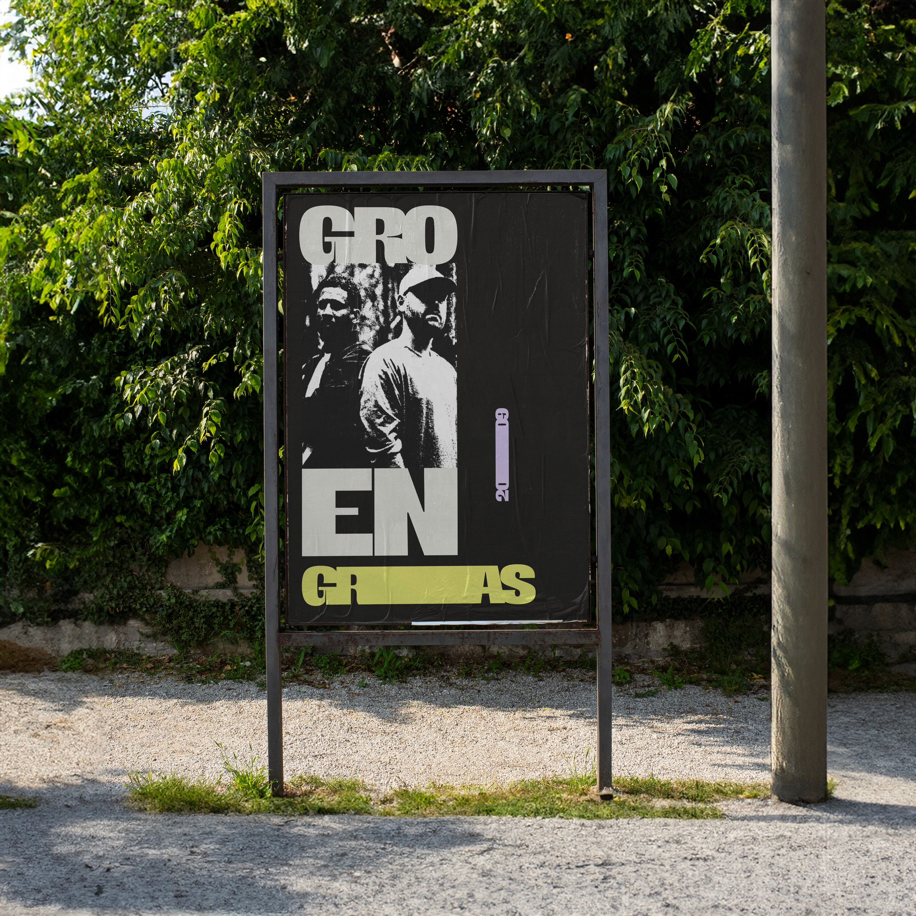
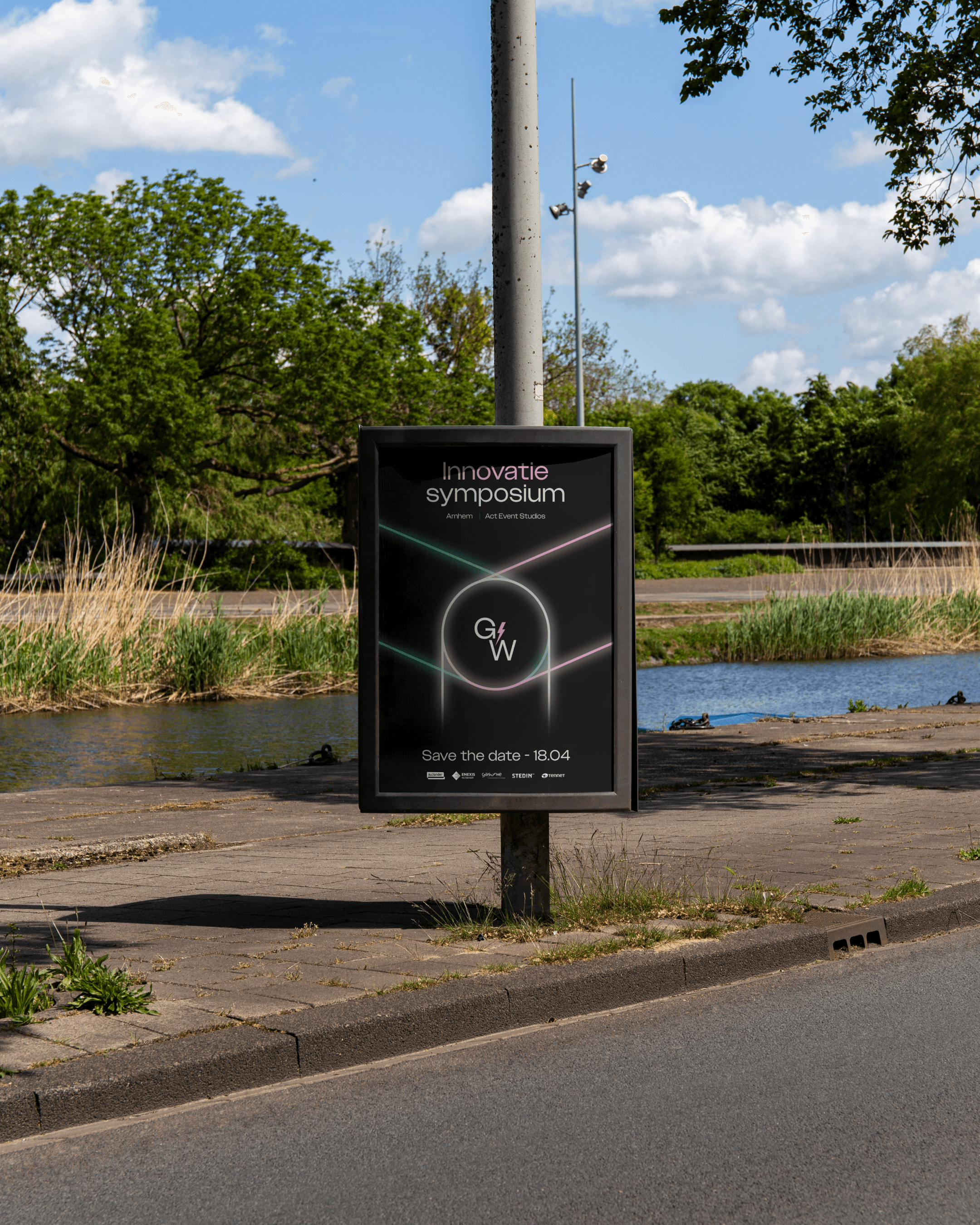
Posters
1
The Logo
On the website the logo is applied inverted and scrolls along with the page. Only three logo/background combinations are allowed.
Logo × background
3 combinations
2
Color
Mostly greys. Two loud accents.
Purple and red only as a 2.5% spice.
Seven brand colours make up the palette, but not every colour may carry a surface. Only black, light grey and mid grey work as backgrounds; blue and green are reserved for accents. Purple and red are used sparingly, only when they’re really needed.
Colour
Palette
3
Typography
Druk Wide Bold sets headlines and highlighted words. Inter Light carries body copy and quotes. Fixed sizes, line heights and spacing keep every layout consistent, and text colour always follows the background.
Headline
Druk Wide Bold
Body
Inter Light
Text × background
Contrast
4
Highlights
Highlighted words switch to Druk Wide Bold and get a border measured from their highest to lowest point, with equal margins all round. The words in between stay in Inter Light. Each quote uses either blue or green, never both.
Highlighting
Live demo

Webdesign
Mobile

Social visual
5
crops
Photos are cut with squares. Four at most.
The squares decide where you look.
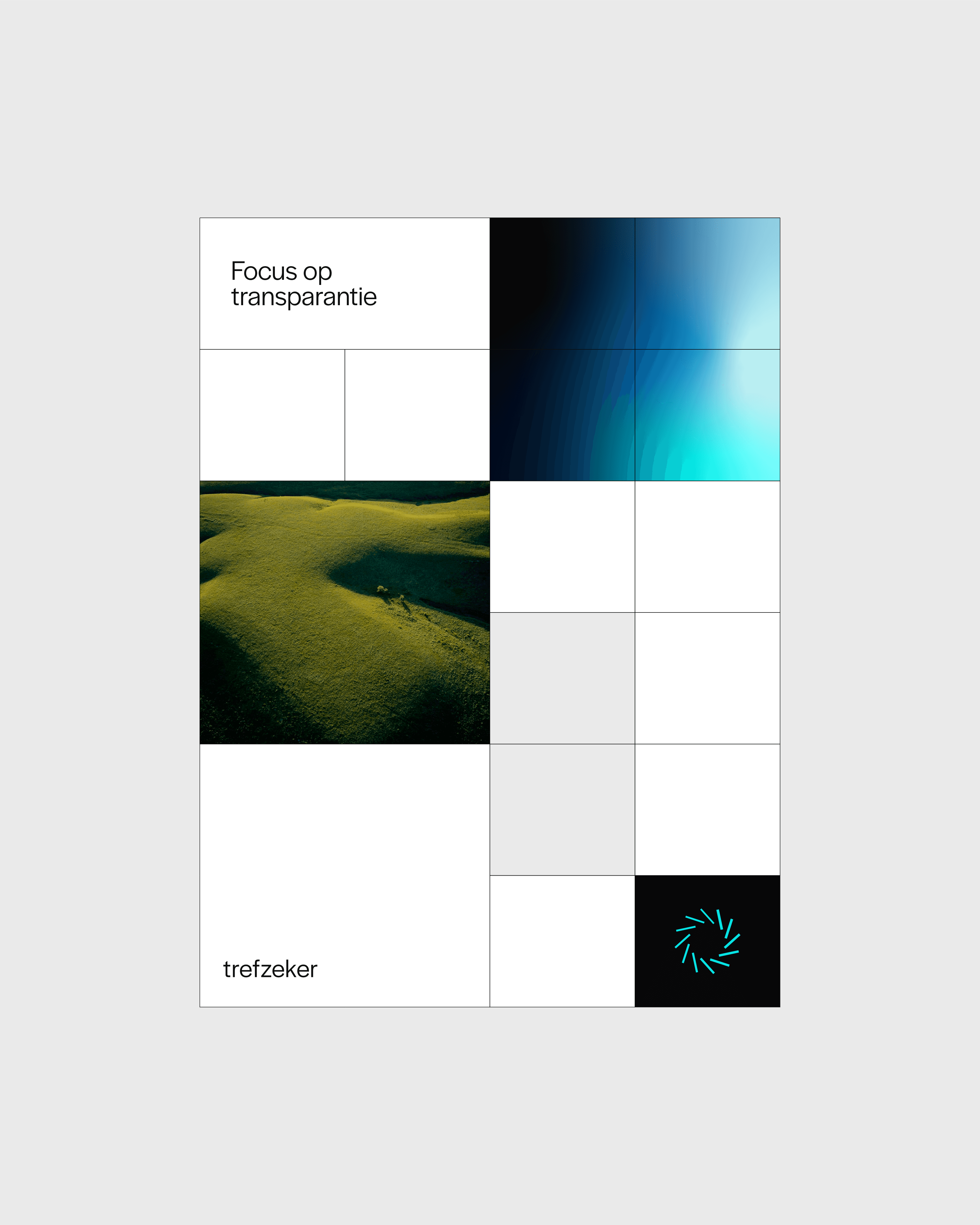
Every image is cropped with square shapes, never more than four per image. Used across website cases, blogs, social visuals and presentations.

The use of grids
Max. 4 squares
6
buttons
The smallest rule, and the place where the whole system meets the interface.
Buttons
UI

Website
Homepage

Business card

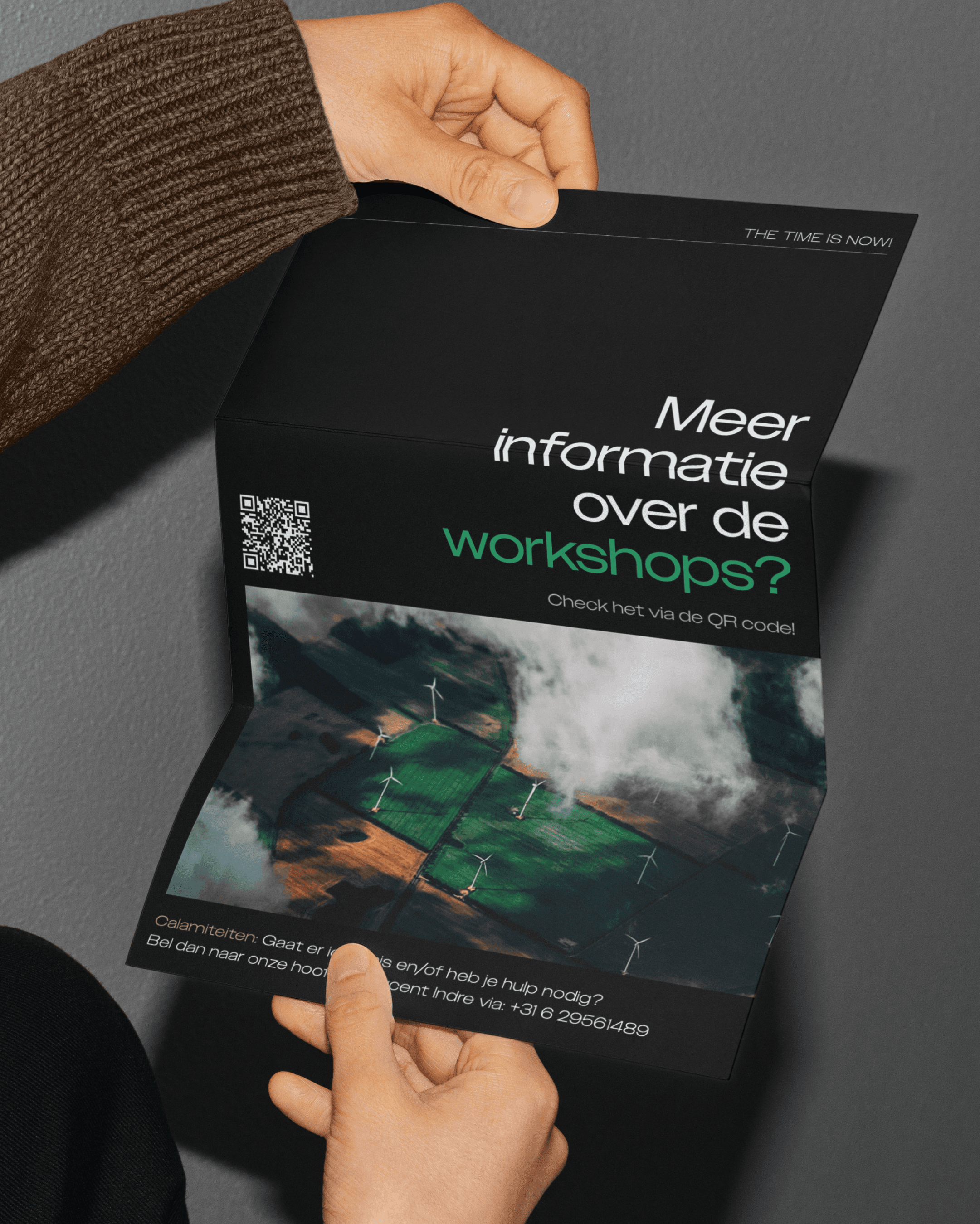
Flyer A3